Sunday October 2nd, 2016 :: 10:46 PM
Whoa!!! Haven’t written in here in a very long time! My friend @iPlop and I just released Leaf and would love for you to check it out if you haven’t. We released it with a fully new UI system with minimum features that we plan to add more down the road—very soon actually so be sure to check it out! 😀 (Crazy how I skipped over 2015!)
Sunday January 12, 2014 :: 2:41 PM
ayecon for iOS 7 status update
Jailbreak is available for all iOS devices (up to iOS 7.0.4). Cydia Substrate has been updated and now WinterBoard is updated, which means update ayecon!
I spent the past week optimizing ayecon for iOS 7 (stock iOS icons) and it look so amazing! The only problem now is that Apple removed “[email protected]”, which give every single iOS icon that unified “ayecon” look… uh-oh, right? No.
Well, now what? First, I need to literally mask (not redesign) hundreds (maybe thousands?!) of apps so they look unified. I will start by masking the popular App Store icons and make my way down the list (this also includes Cydia tweaks with app icons). I plan to release an ayecon update once every week or so so that you can have a better (full) experience with ayecon.
If you are one who just cannot wait to have a certain app icon(s) masked due to OCD (that’s me), I will provide a PSD file in the next ayecon update that will heavily be all about icon optimization (iOS 7 support). I tried to make the PSD file as straightforward as possible to mask. Afterwards, you can feel free to send me your masked icon(s) so I can include in future updated or just keep it for yourself, whatever works for you.
With all this information, expect the first ayecon update later this week and thank you for your patience and support.
Friday September 27, 2013 :: 1:43 PM

3 months ago, I installed iOS 7 (beta 1) on my test device (iPhone 5) but because it wasn't my main driver, I didn't spend enough time with it. My first impression of iOS 7 (in June 2013) was "wow!". I didn't know what else to say or think, after all, it was still in beta so I promised myself (something I should stop doing :P) I wouldn't write about iOS 7 until the public release and until I've actually used it. Shortly after the release of iOS 7 beta 2 (or 3, can't remember), Apple randomly signed iOS 6.0.2 which led me to downgrade—bye iOS 7, till now.
Exactly a week ago today, I purchased an iPhone 5s at launch (now my main device) which comes pre-loaded with iOS 7, yay, right? So now that I got to spend some time with it, I'd like to share what I think about iOS 7.
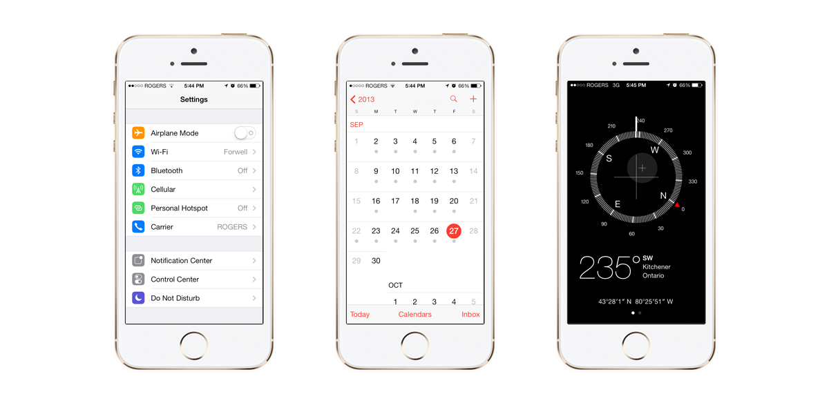
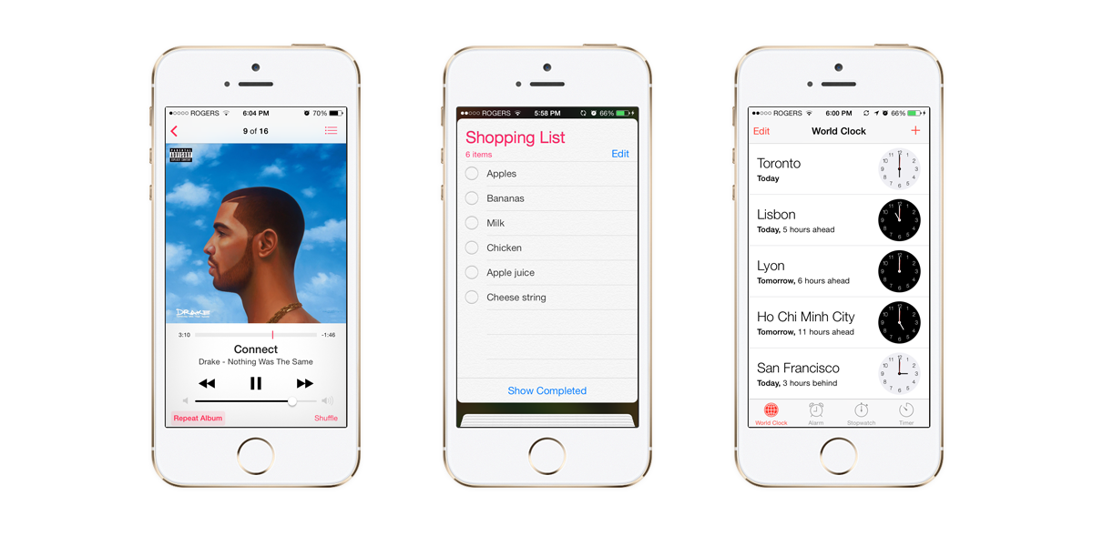
iOS 7 brings an all-new UI (user interface) and for the most part, I really like it. The refined typography makes reading emails, creating reminders and typing up notes, which is what I'm currently using to write this blog post, is so much easier due to the use of hierarchy (font styles and colours). The use of white space in specific apps such as Settings, Calendar, Compass, Music, Reminder, Clock and Phone app are very well executed. See, that's another reason why I went with a white front panel device because most of the UI is white, so using it as a whole (hardware and software), it just looks so much better and make sense.
Being an Apple fan(boy) for years, I'm actually going to enjoy this part where I get to bash Apple, a little. The first thing that caught my eyes, and probably many others, are the icons. Since 2007, Apple would develop 1–2 new applications and cook em right into iOS like App Store, Compass, Voice Memos, Game Center and even the Newsstand. Each additional app icon seem to fit the iOS family of icons from previous years quite well (minus the gloss that they used since the beginning of time but throughout upgrades, losing it, but whatever).

This year, all the icons changed, following a new grid system and a whole new palette of colours, which I find brilliant because it brings unity to the home screen now. I know this because I've been playing with the new grid system for a couple months and I can't wait to show you what I've come up with—but that's another day. What really bugs me about some of the current icons on iOS 7 is the execution, where we have a variety from "flat" to "a little more decorative". On stage, at Apple's special event on September 10, 2013, Craig Federighi highlights that "iOS 7 is so alive with depth and not through artificial shadows or borders", yet, Game Center, Contacts, (kind of) Notes and Video icon use shadows or gloss and that's where I feel the disconnect (could also be my OCD).
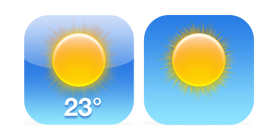
This is also a great time to briefly touch on iOS 7's gradient choices. Did you know that Apple's mail and weather icon were always going the "wrong direction" this entire time? But because they had clouds and temperature text at the bottom, it was smartly disguised. Let me show you:

I'm happy Apple removed all the linen texture from previous iOS… it made me feel claustrophobic, all trapped in a 3.5"–4" screen with this dark linen *shivers*, so yay to frosted glass! It's not just the frosted glass from the Notification Center and Control Center but from everywhere else to give us "a sense of our content" from Mail, the keyboard, Spotlight etc. because every device is personalized to be yours based on the wallpaper you choose (unless you use the same wallpaper as your friends). I bet you can't make your spotlight this exact colour:

For user experience, Apple is trying to do something cool (and new-ish) with their animations from what happens when you unlock your device to what happens when you lock your device. I understand the animation is trying to take us from one place to another in a visually pleasing way but take me there just a little faster, please? For example, animations like how:
- The icons fall into place when you unlock the device
- Subtle animation when activating the new multitasking view
- The icons suck back when you click the home button
I feel like things should be almost instant when I tap on something. For example, when I go to unlock my device, I'd like to tap on the Twitter icon but with the speed of the new animation, I have to idle myself an extra second longer before doing so. It's not just that, after a while, the animations become choppy and it's a big turn off (when it works smooth, it's great)! I'd like to add that the wallpaper parallax effect is a great addition to the home screen that I keep enabled because it makes my phone feel more alive/interactive. I do notice that there are times where the parallax crap out and "reset" its position and it's not pretty to look at (when/if you notice it). Yeah, yeah, I know Apple introduced the new A7 chip on the iPhone 5s but unfortunately, I'm still experiencing lags during animations so I could only imagine how the iPhone 4/4S users feel.

Functionality wise, every app seem to work as it should but I'd like to focus in on the App Store for a moment. I've had so many issues with this app alone that I don't even want to open it anymore (but I have to if I want to update my apps of course). I don't know if I'm able to compare the mail app to the App Store app but why does the Mail app have a pull-to-refresh feature while App Store doesn't? Mail has this automatic push/fetch feature but sometimes I'd like to just open and pull-to-refresh because I feel it's not fetching in the background so then I'd have to—same thing applies to the App Store. I think every time I tap on the Updates tab, the app quickly fetches new information but there's really no indication (sometimes not even in the status bar) and in the sense, I feel insecure. Many times, I would tap the Updates tab, wait a couple minutes and the "No Updates" icon/message would pop up so then I close the app. As soon as I close the app, I see a (1) badge above the App Store icon and get confused so I launch the App Store app and there's an update! Apple did introduce "Automatic Downloads" in iOS 7 but then it goes back to that I'd like to do it myself just because I like that excitement.
Overall, iOS 7 is a great software update compared to past firmwares so anyone who isn't jailbroken, updating wouldn't be a bad idea… that is, if you can get pass the app icons. If not, that's where I'll come in… ;P

Wednesday October 09, 2012 :: 9:56 PM
So this is what I've gathered from my trip to San Francisco for WWJC: iOS 6 is available for the public—there's only a tethered jailbreak for all iDevices in the market (minus iPhone 5) and there's currently no way to downgrade once you're on iOS 6 to iOS 5.x. WinterBoard is basically broken on iOS 6 (themeing any UI elements such as navigation bars, lockscreen passcode images—basically anything that starts with "UI" in the filename will not work right now). I've already reported this bug to @saurik and he's "working on a fix" so until then, I do not plan on updating ayecon for iOS 6. Why? Because I don't know what else is broken so I can't fix it until I have a 'for sure' that 'this is not working'.
I recently got hired by @pod2g, along with a few other jobs for others. This is gonna be a busy year for me but do not worry, I'll try my best to keep my themes updated as much and as soon as possible.
Oh, one last thing… I recently redesigned my Portfolio page on this website so if you haven't checked it out, feel free to click the top "Portfolio" text and check it out!
Sunday August 19, 2012 :: 10:44 PM
With ayecon for iPad recently released, looks like that's all the themeing for me, for now. I had no clue that ayecon would be this popular to the point that when I was going to release ayecon for iPad, everyone was stoked and was waiting for it to release. Even with ayecon for iPhone, there were people already waiting on Cydia, continuously refreshing. I mean, I even had people tweeting me at exactly 12am letting me know that ayecon's available—before I could make the official tweet—CRAZY stuff! :P
After the release of ayecon for iPhone, I've pushed out over 5 updates in the last 5 weeks—which is pretty insane! That was me at my best working full time on this theme. I had no intention of making ayecon for iPad but because of the emails I was receiving, I gave in and decided to give everyone what they want. It did take a little over a month because I had to redesign each icon from scratch but I mean, was worth the wait, right? :) For now, I will sit back, relax, drink my tea and continue to release updates (not just for ayecon, bot inPulse, iRetina and my other themes). I do not plan on making this my full time job but if I do receive a steady paycheque every month, why not? …But I have seen the number of piracy on ayecon and ayecon for iPad but it makes me sad, but that'll be another day.
Tuesday July 17, 2012 :: 5:03 PM
For those wondering about ayecon for iPad and its release date, the only thing I can tell you is that it's currently in beta testing. What this means is that it's almost ready for release but I want to make sure I have all of the popular icons from Cydia and App Store "ayeconified" and making sure it works on all iPads and firmwares. That being said, the release date is ~3 weeks away (hoping that testing goes well).
Tuesday June 19th, 2012 :: 3:37 PM
How to fix small Switcher and Folders issue
It has come to my attention that quite a few number of people are getting the eerie Switcher/Folder bug that may look similar to this:

I've been receiving an extensive amount of emails, twitter mentions and even text messages in regards to this 'bug' and I want to make a few things clear; this is not a WinterBoard issue, nor is it an ayecon issue. What's causing this 'bug' are bad hooks from tweaks like 'FacebookThis', 'iOS 6 Photos Menu' and/or whatever other tweaks from developer, NobitaZZZ, had made, which are in Cydia. To fix this is quite simple, uninstall his tweak(s) and run a correct repring method, until the developer submits updates to Cydia, addressing the issue.
Quick 2 step guide on a temporary fix for Switcher/Folder bug:
1. Uninstall FacebookThis (or any other tweaks by NobitaZZZ)
2. Launch WinterBoard, disable and re-enable a theme, respring!
Friday June 8th, 2012 :: 12:00 AM
…and ayecon is now available in Cydia Store for $2.99! Make sure you visit the ayecon section for all the details. Thank you everyone for your support! Not much else to say—enjoy!
Tuesday June 5, 2012 :: 10:42 AM
ayecon's been submitted to BigBoss repo. If all goes well, it'll be up Friday, if not, well… more waiting. :P
Monday June 4, 2012 :: 9:21 PM
Internally, this website went through a bit as of late from being reprogrammed to moving servers, it's great! I want to thank @icj_ for the help, wonderful person, thank you!
ayecon, wow… there's been a lot going on with this theme. I don't remember inPulse grabbing this much attention when it was being released. I mean, there's even a person counting down the days, hours, minutes, even seconds, this is crazy! At the same time, it feels like the bar's been set so I hope I meet everyone's expectation and release a great theme for all.
As of right now, everything's ready to go—beta testing is in affect. Tonight I plan on finishing up everything (customizing some more icons, adding more UI images that I'm missing, couple more wallpapers) and submitting ayecon to the repo and HOPEFULLY have it ready for Friday. Even though I say Friday is the release date, something /might/ go wrong with the acceptance process… who knows. Any ways, if you want to keep up to date with ayecon, click on "upcoming" on the top right.
Tuesday May 15, 2012 :: 10:40 PM
If you haven't already guessed it by now, I am planning on releasing a new theme. Why? Because I want to see something new, don't you? I've spent quite some time looking around on the Internet, and Cydia and so far, nothing to my taste. I like something that fully utilizes the Retina display, something with colours and pays really close attention to the little things - details. Don't get me wrong, there's a couple but they're either black or white with amazing attention to details (but no colour), or no details at all with a ton of colours! So that's where I am gonna come in and make something that utilizes colours, attention to details and other small stuff that others wouldn't really notice but nice to have any ways. Unfortunately, this is all talk and no screenshots, yet.
Tuesday January 03, 2012 :: 2:50 PM
A little late but Happy New Year! Now that that's all cleared up, it's back to work. First off was iRetina(+ and ++). The most needed icon was the new "DropWin" feature that BigBoss released when he released his SBSettings which would be fully functional on iOS 5 and rendered iRetina a blank icon for where it was needed. Have no fear though, today's iRetina(+ and ++) update has added that feature.
Next up is my most popular (out of the 2, inPulse and Metius) complete iOS theme: inPulse. Haven't been able to look at it and how it worked out on the final release of an iOS 5 ready WinterBoard, I could honestly say that inPulse was all beat up by iOS 5. All of the fancy features that made inPulse weren't working, such as: 2x2 folders, iPod navigation bar, notification center was unthemed, wallpapers didn't show, passcode had "Emergency Call" and "Cancel" illegible and all sorts of things, just brutal. Any ways, I spent literally a night fixing everything up (with help from my good friend Maximus), everything is looking tip top! Here's the full inPulse (retina) 2.2 changelog:
- Fixed 2x2 missing third icon bug (iOS 5 only)
- Themed Notification Center (iOS 5 only)
- Themed Camera shortcut icon (iOS 5 only)
- Fixed visibility in "Emergency Call" and "Cancel" button in Passcode screen
- Fixed 2x2 distortion bug
- Added Respring button for 2x2 folder feature
- Added 3 more colour varieties in Wallpapers (red, green and purple)
- New icon for folders
- New background for folders
And there we have it. Release? Simultaneously with A5 jailbreak :) I know the wait was long, but it's definitely worth it. :)
Tuesday December 27, 2011 :: 11:18 AM
Merry Christmas/Happy Holidays! Just wanted to give a heads up that iOS 5.0.1 for non-A5 iDevices is released (many many thanks to @pod2g, more info on the jailbreak here) and, of course, I got on that and just jailbroke my iPhone 4 and installed inPulse asap. I am currently looking into adding stuff and fixing a broken one (2x2 folders). At this time, 2x2 folders is being a little tricky on iOS 5 and that's why it's taking a little longer this time around. What I might do is release a temporary fix and continue to do backend stuff to fix it so it doesn't look stretched and what-not on your iDevice(s). And so that's the current status on inPulse (retina).
As for inPulse (non-retina), a port is being worked on (no ETA) and I am trying to get it done sooner than later (sorry for the long wait, but it's worth it). Any ways, that is all. I hope everyone enjoys their holidays and got what was asked for. :)
Thursday July 21st, 2011 :: 1:16 AM
inPulse for iPad is a huge success! I have to admit, it does look a lot better than the iPhone and iPod version. I've learned a lot from re-optimizing inPulse for iPad and it's time to apply it to inPulse for iPhone and iPod touch. Let me show you a comparison.
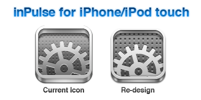
There are huge differences and it only gets better when it's on the iPhone or iPod touch, utilizing the retina display. So basically what I did/planning on doing is re-design every single icon to make it look like the "re-design" one that'll be smaller, correct lighting and crisp details.
Q. Why did you make it smaller?
A. On a smaller screened device with big sized icons, you lose the background and everything just looks cluttered.
Q. The lighting was fine, why fix it?
A. Only to the untrained eyes does it looks "fine", but if you haven't noticed this yet, I am all about quality. You get what you pay for.
Q. Does this mean I have to re-purchase inPulse for my iPhone/iPod touch? OMG!!!
A. No, it's a free update. (for current inPulse users, of course)
Q. How can you add more detail to something that's already perfect?
A. Perfect? I just want to give my customers the best theme ever on their iOS device.
More details will be given later. (Screenshots as well)
Saturday July 2nd, 2011 :: 4:34 PM
What a crazy morning! Long story short, comex's iPad 2 jailbreak got leaked and I got my hands on it before it was taken down. With all that, led me to today's blog post. I jailbroke my iPad 2, can you guess what I installed right after? That's right, inPulse, along with WinterBoard (of course) and let me tell you, it look so bad! So bad, that I will be spending the next few days (putting aside Metius) reoptimizing inPulse specifically for the iPad. The demands for inPulse for iPad are so great, that that's why I am taking my time and going back and redesigning it. "Why not to take the retina icons, drop it in Photoshop and resize it and call it a day?" Well, here's a visual image that'll speak for itself:
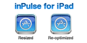
I spent the last 5 hours re-designing just 1 icon/template and it looks great. Time for a break, and will continue to do the rest. Release date? I'll keep you updated.
Friday July 1st, 2011 :: 10:53 AM
First of all, for all the Canadians out there, Happy Canada Day!
What a crazy release day for Metius a few days ago. Metius was released 3-4 days ago and sales have been steady so that's good. To show my appreciation and that I am still on top of my game, I've submitted a minor update for Metius that will be available for today (in about 3-5 hours). The update is just a image fix which includes:
- 4.2.1 Lock Screen image fix
- Calendar title/date alignment
- Shrink shadow fix
The above should have been fixed in 1.0 release so that's why those are top priorities. Oh, and Metius does work on iOS 5 beta 1, NOT iOS 5 beta 2. Why? Because WinterBoard is broken on iOS 5 beta 2, but (now) works flawlessly on iOS 4.x firmwares.
Monday June 27, 2011 :: 11:15 PM
Metius is now available on Cydia Store for $2.99, It's always nerve-racking when it comes to releases. Why? Because I don't know how people will take it. I don't know if it'll work on every device and what not. (that is one of the reasons as to why I have a test group to test my theme) I think I need another retina display device as well, possibly an iPod Touch 4 but at this rate, I don't think I can afford it because paying my tuition is more important than anything. Back to the release. I hope you all (the ones that bought it at least) like it.
It does feel great though, to know that there are people in the world using my work, on their device(s) that they use on a daily basis. It looks me a great while to get the silver metal colour, along with the details to look like how it does. The hardest part was trying to duplicate the lighting/shine, which I believe the end result was nice. I had a lot of fun with this theme and will continue to complete it and release more updates. Oh, as for the inPulse users, I haven't forgotten about you. I am still trying to add a little more here and there to make the 20+ MB update worth it because honestly, would you really want to re-download a 20+ MB theme for 1 new icon or something small like that? Not really, right? Yes, current status: Working on an inPulse update, along with more Metius goodies. Oh, and other small side client projects, yes, very busy summer! I love it!
Friday June 24, 2011 :: 1:57 PM
Finally submitted Metius to ModMyi. For those still asking, it will be available in the next 3-4 days. I will explain the process of submitting tweaks/themes to Cydia. (just in case any of my readers were wondering and for future reference?) If it's a free tweak/theme, the process takes 24 hours because it doesn't go through saurik. However, if you are submitting a paid tweak/theme, the host (ModMyi, BigBoss etc.) will take your package, test it, then send it off to saurik. Why does it take saurik 3-4 days to process it? Who knows, but that's how it goes, I don't bother asking. So with that said, expect Metius in Cydia Store on Monday? Latest would be Wednesday for whatever reasons. What to do next? Probably adding content to the Display Case section.
Friday June 24, 2011 :: 12:18 AM
Exhausted. It took literally 6 hours to perfect this site and I haven't touched Metius yet, but that's what I will do after some sleep. Just wanted to blog a bit about how this site is coming along. So far, so great. I can't wait to tweet this website out for my followers. So excited.
Thursday June 23, 2011 :: 6:44 PM
...and the site is up! A great big thank you goes out to iH8sn0w for hosting my website. Now that that little hosting hunt is over, the real fun can begin. I will be spending the next few days uploading content, making this website less empty. :)
Wednesday June 22, 2011 :: 11:27 PM
So I finally got around to making the website. The website to where I will post thoughts, recent work, upcoming stuff etc. I also made it a place where you can come and download cool wallpapers, custom single icons and other stuff. Yeah, I use the word "stuff" a lot because "stuff" sums up everything. That's it. Welcome.